Toussini.de is a website that offers Circus Projects for schools and circus Team events for companies. To improve the experience for the customers, the information on the Website needs to be organized in a way that the most important Information can be found as fast as possible. While the initial Website was super text-heavy and old-fashioned I took the existing information and created a high fidelity prototype with a clearer and more usable design.
Project Overview
Timeframe
February 2021 – June 2021
Keywords
Redesign, Webdesign, User Experience, User Interface, Logo Design
My Task
Redesign an existing Website
Design Tools
User Personas, Adobe Xd, Photoshop, Illustrator
Timeframe
Keywords
My Task
Design Tools
February 2021 – June 2021
Redesign, Webdesign, User Experience, User Interface, Logo Design
Redesign an existing Website
User Personas, Adobe Xd, Photoshop, Illustrator
The Challenge
Goal of this project was to take an existing website with a questionable user experience and show what potentially could be improved by designing a high fidelity prototype. At first I put a strong emphasis on gaining a deep understanding of the status quo. Then I developed ideas on how the overall user experience could be optimized. I determined the structure and made a low fidelity prototype. This was an important step on the way to my high fidelity prototype in Adobe Xd. The result was then evaluated and improved with user testing.
Most Important Steps On My Design Process
Result of the design process: mobile high fidelity prototype
Result of the design process: mobile high fidelity prototype
The result of the design process was an optimized version of a clickable high fidelity prototype. The final version has an friendly and accessible feel to it and is broken down into only the most important elements to guarantee the highest usability without any redundant design elements. The prototype has a desktop and a mobile version. Both are consisting of an homepage, some detail pages and a contact page. These can be accessed by the navigation bar in the desktop version or the hamburger menu on the mobile version.
Design Phase: Redesigning the Toussini Website
Logo Design
After I went through an detailed discovery phase (which I am going to present later in this case study), I started to design the logo. Herefore I went for an minimalistic yet elegant approach. I used simple geometric shapes to create a circus tent. This is a reference to the indoor and outdoor circus tents Toussini owns. The brand name is written in the Google font Vidaloka, which is also used for headlines.
Typography & color
Typography & color
The next step was to decide for a color palette and a typography that reflect the character of Toussini. As a font for headlines I used Vidaloka, which combines the seriousness of the teamevent section with the playfullness of the school project section. Raleway is used for the running text. What makes this font special is that it also has a slight playfullness to it yet it is very readable. Concerning the color palette there are two color combinations. The dark red with the dark blue represents the seriousness of the teamevents while the vivid orange with the light blue is used in the school project section.
Clickable low fidelity prototype
Before I was able to create an appealing high fidelity prototype, I needed to find out more about how I wanted to display the content of the Website. The best way to gain a better insight into this issue was by scribbling wireframes. First, I scribbled every site of the desktop and mobile website on paper. As it was solely about the content, I could do this very fast without worrying too much about the looks of the wireframes. Then I took a photo of the scribbles and transferred them into Adobe Xd, where I connected the art boards and made them into clickable prototypes. Now I could use them as the skeleton for my high fidelity prototype.
Thanks to the wireframes I was able to focus completely on the visual design of the website. As it would be too time consuming to design every single page of the Toussini website I took the user journey of the team event persona Elke Carver and designed especially the sites that were crucial for her use case which will be portrayed later in this case study.
For the general homepage I used a funny picture of a children’s circus team. I couldn’t actually use pictures from Toussini as their photos had very poor quality. On the opposite of the header picture there is an introduction sentence to inform the user what this website is about. Beneath, there are two teasers that link to the individual homepages of the two target groups: the school projects and the team events. The mobile version is very similar to the desktop version. Only the different elements are arranged below each other as the desktop has a higher width.
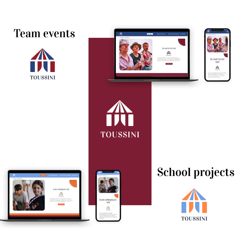
Team event overview
The overview site of the team events also has a spacious header section with a appealing team picture and a introduction text. It also has an own logo in the colors of the team events. Below, I created a table like section where all the different kinds of team events are listed. For every team event there is a short information so the users can compare the different kinds of team events at one glance and decide for their favorite event. This information can also be collapsed so it doesn’t take all of the place. From there you can navigate to a detail page of each team event and collect more information.
School project overview
School project overview
The school project overview is very similar to the team event overview. The main difference is the colors and the pictures. There’s also an overview table but in this case with the different kind of school projects.
Contact site
The main call to action is for the user to fill out the contact form. Therefore the contact site is one of the most important pages on the whole website. Therefore I paid a special attention to a usable approach on this page. On the left there’s the contact form. The user only needs to write text where there’s no possibility to replace it with a clickable option. In order to gain trust, a contact person is listed on the other side. This way also users who prefer personal contact are satisfied.
Discovery Phase: what Toussini looked like before the Redesign
Old Logo
Old Logo
The initial Toussini Logo has a rounded font and therefore has more of a soft and childish appeal. The ‘O’ in the brand name is filled with red and looks like a clown’s nose. The white reflexion could be confused with a cross. There are two different versions of the logo depending on the background. Only the white version on a dark background has the addition ‘Circus Mobile’. The reason could be a missing consistency in the brand design.
Old Typography & Colors
There are two main colors on the website of Toussini: a light red and a warm yellow. Both are very saturated and have a bright appearance. The two colors do not really match well together. Unintentional associations could be mustard with ketchup or the McDonalds clown.
Old Homepage
Old Homepage
The first impression of the Toussini website is friendly but surely not modern. The header seems kind of chaotic as the picture is a collage of two different group pictures: one of a school project and one of a team event. Both pictures seem crowded which add to the noisy impression of the website. The elements are designed and arranged in a old-fashioned way. Also the color combination doesn’t seem harmonic.
Define Phase: Defining the Users and the Structure of the Website
User Personas
User Personas
I thought of the possible customers and created stereotypical representatives of these groups in order to see for whom I’m going to design for. I created two personas: Elke Carver for team events and Julia Blencke for school projects. For both of them I made user journeys in order to see where the individual users need more support.
Card Sorting & Sitemap
Card Sorting is a useful tool to decide which contents you want to display on your website. I used it by writing down all the contents I wanted to display on the Toussini website. Then I sorted them by creating matching categories an order them in a useful way for the website. I used the card sorting to create a sitemap by refining the contents and adding some more information.
User Flows
User Flows
I made user flows for both of the user personas so I could see which ways the users would potentially take through the website. For this I tried to empathize as much as possible with the personas and to take the individual goals, pain points and needs into account.
Testing Phase: Asking the Users
Usability test
After every complete design process there needs to be a testing phase. Only if the users are able to give their feedback, the designer can make sure that the prototype is ready to go into development. For testing the high fidelity prototype of Toussini I asked two of my fellow students to test the desktop and mobile version. I created typical use scenarios and asked them questions about the prototype. At the end of every question the users should evaluate the difficulty of the task on a scale of 1 (very difficult) to 7 (very easy). After all questions were asked the users could give general feedback. In the last step both testers filled out a system usability scale (SUS) which can be used to evaluate the general usability of the product.
Feedback
In general the testers found that the prototype was easy to use. The average SUS score was 86,3% which equals a “excellent usability” according to the general scale. Nevertheless, it needs to be said that the testers were design students themselves so they had a high understanding and experience with websites. Also, it was only two students so the results aren’t representative. It only shows a tendency toward a good usability. The feedback of the testers mainly referred to details. They liked the color concept and the logo. Also they found that the contact form was understandable although a little too plain. The handling of the table for example on the team event overview page caused a little confusion so I simplified it in the final version. The design elements were remarked as redundant.
Improving the high fidelity prototype
At the end of the design process I incorporated all the feedback from the usability test into the high fidelity prototype. Thus a new improved version of the prototype was developed. Some of the changes can be seen on the visuals beneath and on the side of this paragraph.
Summary and Learnings from this project
In this project I redesigned an existing website by questioning everything that I found out about the brand. I analyzed the status quo to get an impression on potential customers and used personas to build a new brand personality with a complete different visual appeal. First I decided on the brand aspects like the logo, typography and colors. Then I defined the information architecture and contents. First I displayed them in form of clickable wireframes. Then I designed a first version of a high fidelity prototype. I especially enjoyed testing the prototype. I gained insight into issues that I didn’t recognize anymore because I was too deep into the topic. A surprising insight for me was that sometimes design elements only distract from the actual goal of the website and therefore should be eliminated. The usability test helped me to improve my high fidelity prototype.


