Receibra is an app for little businesses and private users to help them manage their finances in order to be more organized when doing their taxes. It solves the problem by providing the opportunity to upload and label their invoices and turn them into insightful charts and overviews. My role was to refine the business idea together with the two founders and create a memorable brand experience as well as a appealing interface for the mobile app.
Project Overview
Timeframe
March 2021 – present
Keywords
Appdesign, User Experience, User Interface, Logo Design, Brand Design
Team members
Sebastian Sander (founder & developer), Thomas Pohl (founder & developer)
My Task
Refine the Business idea & design the user interface
Design Tools
User Personas, Design Thinking, value Proposition canvas, Adobe Xd, Photoshop, Illustrator
Timeframe
Keywords
Team members
My Task
Design Tools
March 2021 – present
Appdesign, User Experience, User Interface, Logo Design, Brand Design
Sebastian Sander (founder & developer), Thomas Pohl (founder & developer)
Refine the Business idea & design the user interface
User Personas, Design Thinking, value Proposition canvas, Adobe Xd, Photoshop, Illustrator
The Challenge
When doing this project I’ve overcome many challenges. The first challenge was to get a deep understanding of the problem we wanted to solve. The initial idea for the app came from Sebastian Sander and Thomas Pohl. As they were mainly specialized in the developement part, I took over the role of the design lead. To refine the business idea, I initialized a design thinking workshop with the three of us. As all of us didn’t know that much about accounting, our challenge was to dive deeper into this topic. Also until that point there wasn’t that much knowledge about other businesses with similar tools that we have to compete with. So in the design thinking workshop we analyzed these competitors and developed ideas on which market niche we wanted to occupy. One of the main challenges was also to create a usable but also visually appealing interface that solves the problem of the user. In the next parts I’m going to explain how I’ve overcome these challenges.
Most Important Steps On My Design Process
Result of the design process: mobile high fidelity prototype
Result of the design process: mobile high fidelity prototype
At the left you can see the result of my design process which is a interactive mobile high fidelity prototype created in Adobe Xd. By following the button on the left you can click through it yourself. It was only the peak of a successful design process which I will describe in the following paragraphs. Without this detailed groundwork, a good prototype wouldn’t have been possible. First, I wanted to show the design process. After that I will describe the Discovery and Design phase which I went through before starting to design.
Design Phase: Building a brand personality from scratch
Logo Design
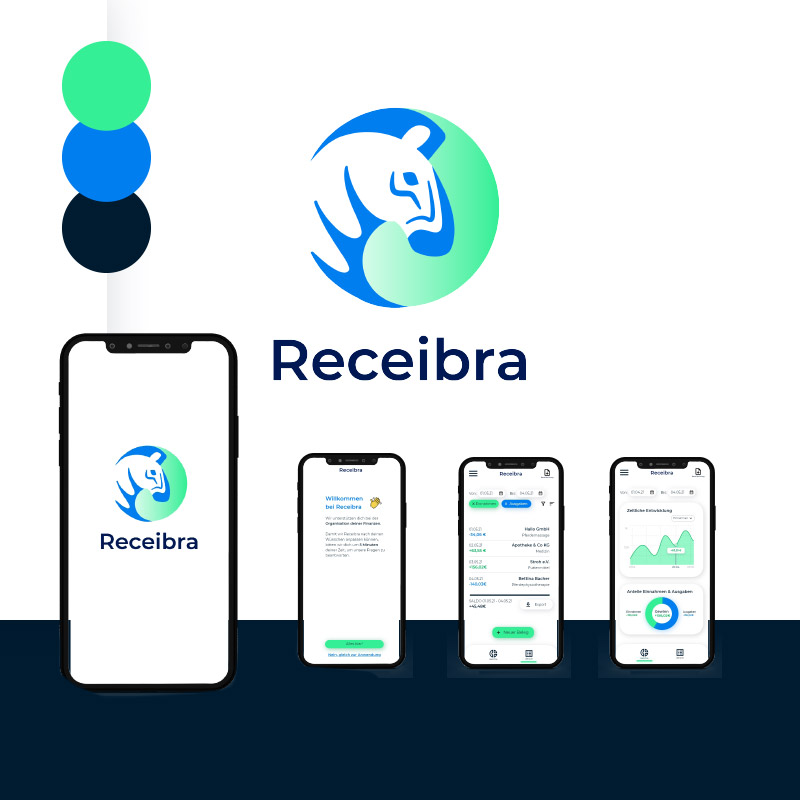
I created the Receibra logo as a word and design mark that consists of the brand name and a circle with a zebra as the brand mascot in it. The brand name is written in the Google font Montserrat bold in a very dark blue shade of the vibrant blue brand color. I simplified the motive of the zebra by shaping it from geometrical forms. In the primary version of the logo the zebra is white with vibrant blue accents. It stands in a circle with a monochromatic green gradient background. This gives it a very modern feel. In exceptional cases, especially in print when the colored logo can’t be used, there’s black and white version as a fallback. There’s also a vertical version of the logo. In the header of the app, only the word mark of the logo is used.
Typography & color
Typography & color
As you can already see in the logo, I chose a color palette that consists of a fresh green and a vibrant blue. As a substitute for pure black I used a dark shade of the blue which melts more harmonically with the other two colors. Overall, the color palette is refreshing yet calming on the eyes of the user and goes together harmonically. The typography consists of the Google font Montserrat in bold and regular. This font is well rounded and has a modern confident feel which fits in well with the brand personality. I only used one font family so it doesn’t distract the user from his/her main goal.
Wireframes
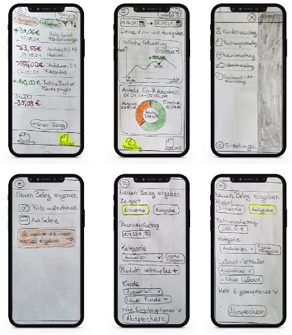
After the main decisions concerning the brand were made, I started to develop the user interface. As I hadn’t that much experience with similar apps, this was a exciting challenge for me. First I wrote down which functions I needed to incorporate. Then I collected benchmarks from similar apps and started comparing them. I took notes on what I found useful and what not. Finally, I was ready to scribble the most important screens in form of wireframes. I ended up wireframing the overview, the reporting with charts, the navigation and the input screen for invoices. The final drafts were discussed with the other two team members. After some corrections I had the go to design the interface.
With the wireframes and a collection of useful benchmarks of other app designs I began to design the look of the interface. On the left you can klick yourself through the high-fidelity prototype. In the following paragraphs the most important features of the app are described.
Welcome Screen
When the user first downloads the app, this will be the first screen after the loading screen that he/she sees. It welcomes the user on the app and informs on the following steps on how to customize the app for the individual needs of the user. If you click on the green button you will continue by answering some questions or you skip this step if you don’t want to answer any questions..
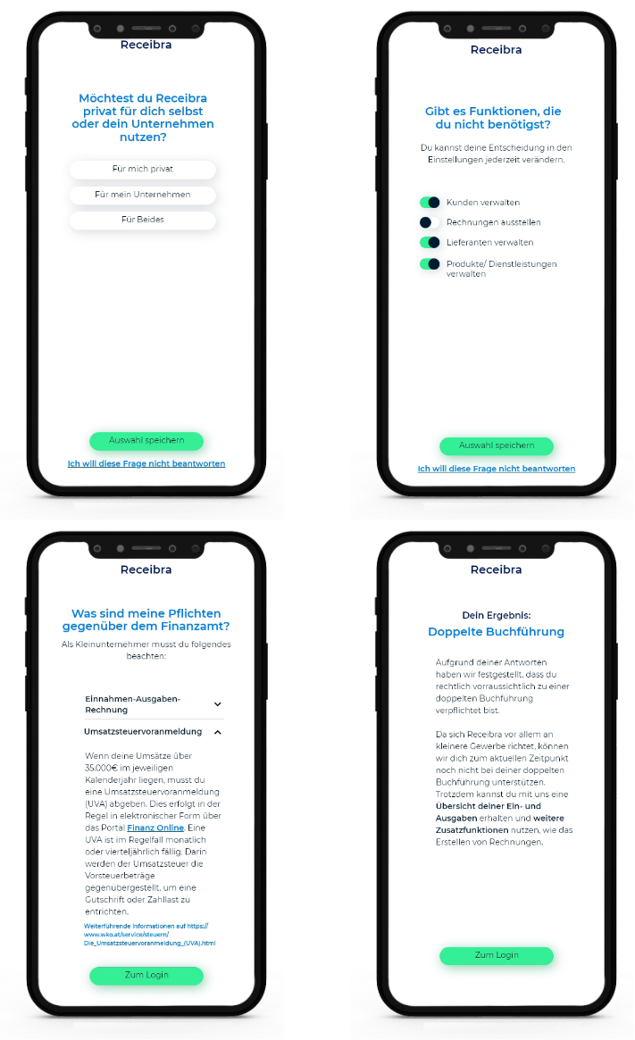
Questionnaire for customization
If you didn’t click on the skip button you will now answer questions on which target group you belong to, what features you want to use and what your obligations in order to do your taxes are. This is especially important for business users because the amount of revenue decides what you will have to hand off to the tax authority. Only by answering these questions, the app can give appropriate advice to the user.
Login & Account Settings
Now after answering the questions, the user has to create an account. The reason for the login not being the first step is that users usually don’t like to submit their data, even more if they don’t have any trust in the app yet. By putting the login field after the questionnaire, the user already showed a commitment and gained more trust, so the probability of the user signing up is higher. After the user signed up, he/she always has the ability to change the account settings as seen on the right.
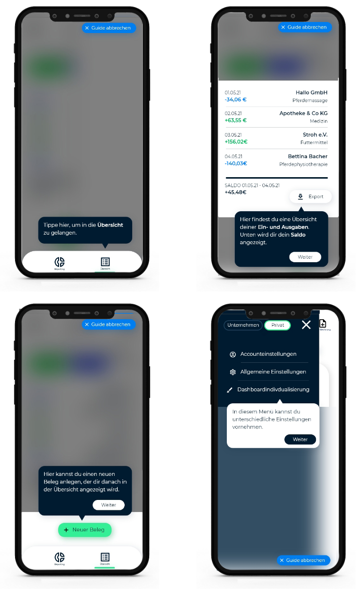
Explanatory guide through the interface
Explanatory guide through the interface
Receibra is an app that wants to support the user through every step, so it*s only natural to offer a explanatory guide through the important functions of the app. It does this step-by-step by placing hints next to individual functions. If you don’t need or want the guide, you can always close it by clicking the button on the upper right corner.
Overview & Reporting
The overview and the reporting are the most important interfaces of Receibra. The overview shows all the earnings and expenses that the user entered into the app over the last time. You can narrow down the shown timespan as well as filter the results or sort them by different criteria. There’s also a button to export the filtered results in the desired file format. With the green button at the bottom of the screen, you can enter a new receipt. At the reporting (right screen) you can see customizable charts with different insights for the set timespan. By selecting the particular icon at the very bottom of the interface you can switch between overview and insights.
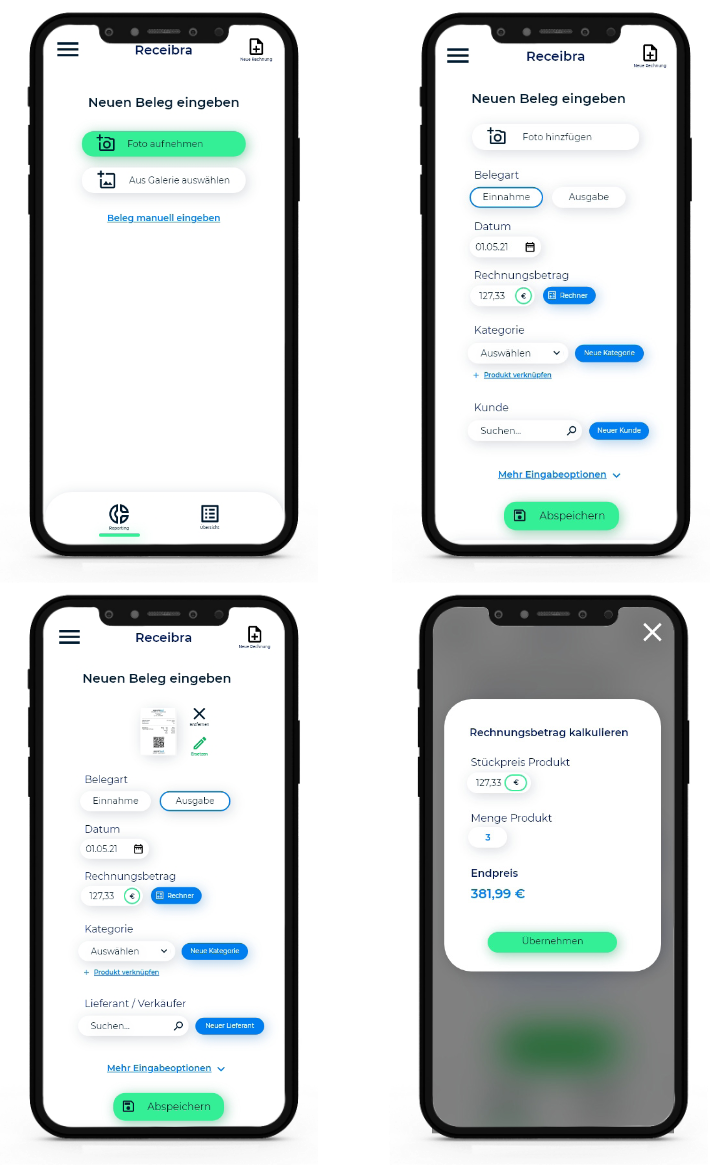
Input interface for invoices
Input interface for invoices
To create insights into your earnings and expenses you first have to enter them into the app. Therefore I created the input interface that can be accessed for example by clicking on the green button on the overview. First you will be asked if you want to capture your invoice by uploading a photo or by entering it manually. If you decided for the picture a KI scans for the important date and enters it into the input fields. You can then check for mistakes and add more info. If you chose the manual option, you first need to decide on whether it is an earning or an expense. Depending on what you chose the following input fields change. One interesting option for the manual way is the invoice amount calculator in which it calculates the total invoice amount based on the price for the individual item and the quantity of the items.
Navigation menu & switch between corporate and private
On the left you can see the navigation menu. The options on the navigation are changing based on what kind of customer you are (corporate or private) and what features you chose at the questionnaire. On the upper left corner there’s a switch between the corporate and private account. This will only be available if you answered that you wanted to use both at the questionnaire. This way, an entrepreneur can manage his/her corporate and private finances at the same time without creating separate accounts or using different tools. The private account has a reduced functionality as there aren’t as much things to keep in mind in contrast to a business account.
Discovery Phase: common understanding through design thinking
Diving into the issue of accounting
Diving into the issue of accounting
In the design thinking workshop we started by getting to know which things a business or private person needs to know in order to do their taxes correctly. This deeper understanding was a crucial preparation for the later design process. In preparation for the workshop I collected all the important information and we discussed it together. So at the end of this step every team member had the same amount of knowledge at the subject of accounting.
Competitve research
One key factor of success in developing a business is to know your competitors. The best product doesn’t work if there’s already businesses that cover the same target market. The goal of this step was to find a niche that competitors do not already cover. As the main competitors we identified zervant, sevDesk and FastBill. What we mainly discovered was that they offer a wide variety of services that our product couldn’t offer due to technical limitations and budget. Also these competitors were mainly focused on medium to major corporations. What we couldn’t find was a competitor that focused on little business or startups that need a little more support on the area of accounting but do not have the budget for a professional consultant. So we decided that our App wants to be a smart helper for these little businesses.
Value Proposition canvas
Value Proposition canvas
The value proposition canvas is a method that can be used to base a business idea on the pains and needs of the customer. The small businesses as our target customers in mind we identified the gains, pains and customer jobs that our product needs to address. One of the key takeaways here was that little businesses want to focus on their core competence without worrying too much about unavoidable tasks like accounting. Also they have limited resources so they want to save time when taking care of their finances. Based on these customer needs we defined what our product needs to be like in order to really support the customer. For example it should be reduced on the main tasks of these businesses and help and advise them on the main tasks.
Stakeholder interviews
Asking the user is a major requirement to make sure that the product develops in the right direction and to gain new insights into the mind of the customer. Therefore, we identified potential users of our product in our circle of friends and acquaintances and asked them specific questions to re-evaluate our assumptions and find entirely new insights. As we wanted to make our product suitable for small businesses but also private users, we asked these two groups for example how they address the issue of doing their taxes right now and what problems they encounter when doing it. Also, we wanted to know what features an app that helps them with their taxes should have and what it should look like. The results of the interview were quite interesting and were incorporated later into the high fidelity prototype.
Define Phase: Defining the Users and the Structure of the Website
User Personas
User Personas
In the design thinking workshop we created two user personas to get a clearer vision of the target groups we wanted to address. The persona Aaron Huber was created for private users of our app and the persona Anna Glücklich represented the target group of small businesses. Both of them are still in their 20s which means that we want to tailor our App mainly on young customers. Also, both personas like to reduce the time spent on doing their taxes. I built the brand and interface design with these two customers in mind.
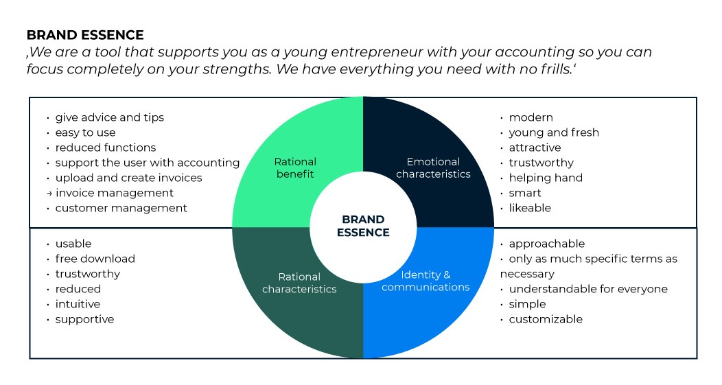
Brand essence wheel
The brand essence wheel is a tool to find out more about what the essence of the brand will be. In the outer circle we filled out the rational and emotional benefits as well as the rational characteristics and the communication style of the brand. A fresh modern and trustworthy feel were very important to us regarding the further development of the brand.
Brand name
When we started into the design thinking workshop there was no brand name yet, so this was the first more creative task to be done. Everyone of the team members brainstormed for potential brand names. Most of them had a sort of reference to invoices or accounting. Some of the ideas can be seen on the right. At the end we went for ‘Receibra’ which is a neologism of ‘Receipt’ and ‘Zebra’. The Zebra as a mascot was chosen because they it has a barcode-like pattern on its body.
Summary and Learnings from this project
In this UX project I took over the leading design role and guided the other team members through the process by applying design thinking methods. I really enjoyed guiding the design thinking workshop. Developing new ideas among the group is a great opportunity to gain new insights, motivate each other and build a team spirit. After this workshop I could feel a much higher commitment to the project in every team member. A surprising insight from the user research was that the interviewed users didn’t see that much importance in the design of the app. There was a stronger desire for a very usable und functional product. It surprised me because I assumed that the young users would put more emphasis on a stylish look than they actually did. The most challenging thing for me was to design an app that helps people with organizing their invoices although I didn’t have any previous experience on this topic. I had to educate myself from scratch and dig deep into this topic which was very interesting for me. At the end I’ve overcome the challenges and build a protoype that all team members were very happy with. In the next step the prototype will be developed by Sebastian Sander and Thomas Pohl and then presented at the young founders program. A successful presentation will decide whether Receibra will be published or not.