Brand Design Muttermilch
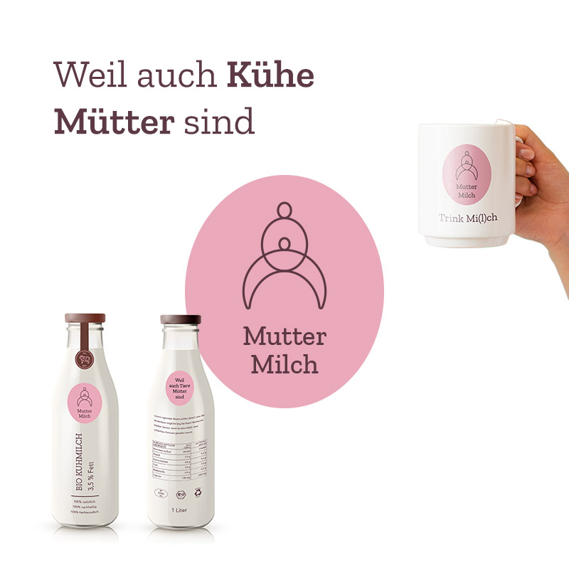
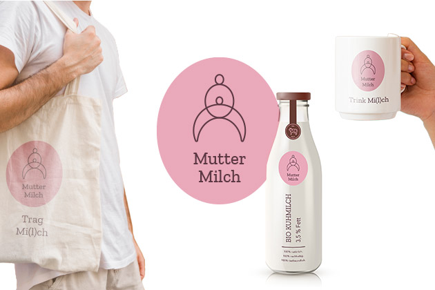
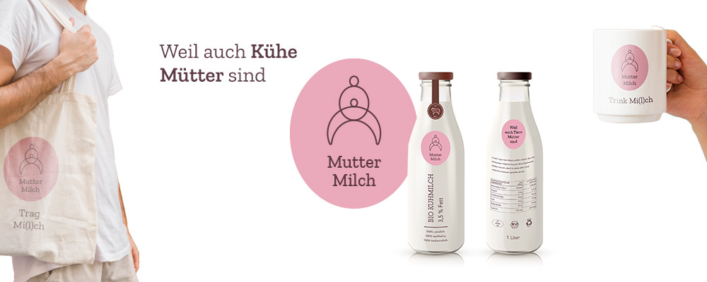
Muttermilch is a fictive dairy brand that focuses on a sustainable production of dairy products and wants to promote a higher awareness for dairy production for the customer. By cycling through the whole design process I was able to create an realistic Brand Experience. I developed a Brand Personality, the Logo Design, a Stylescape Product Design, Design for Social Media and chose matching Product Placements.
Project Overview
Timeframe
October 2020 – January 2021
Keywords
Brand Design, User Personas. Logo Design, Social Media Design
My Task
Develop a brand design from scratch
Design Tools
User Personas, Photoshop, Illustrator, InDesign
Timeframe
Keywords
My Task
Design Tools
October 2020 – January 2021
Brand Design, User Personas. Logo Design, Social Media Design
Develop a brand design from scratch
User Personas, Photoshop, Illustrator, InDesign
The Challenge
Muttermilch was created in a masters course at the St. Pölten University of Applied Sciences. The goal was to build a memorable and compelling brand experience from scratch. The most important part in reaching that goal was to create a realistic brand personality and to think of matching personas who were likely to buy this brand in real life. Part of the Branding Process were Logo Design, Stylescape, Product Design, Design for Social Media and deciding about other matching Marketing Placements.
Most Important Steps On My Design Process
Discovery: User Persona
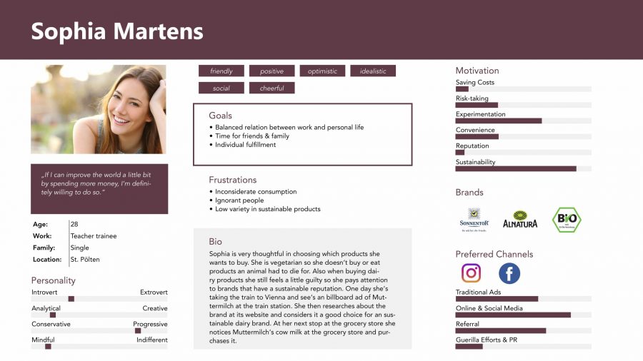
The first step on my design process was to create user persona for Muttermilch. I thought of a typical customer that would buy a sustainable dairy brand. One of the results was “Sophia Martens”, a 28 years old soon-to-be teacher who lives in Sankt Pölten, a city in the same region Muttermilch comes from. My goal was to think of all important factors of the target group that would have an impact on the further development of my brand. I collected all these informations and put them in a personal profile (on the right). All my following design decisions were based on this persona.
Logo Design
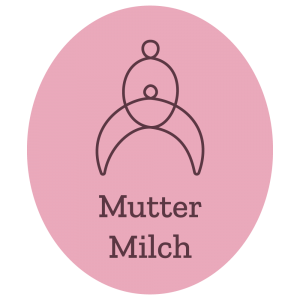
By designing the Logo my goal was to find a symbolic representation of the love a mother and the care for animals. The current Logo is based on the celtic symbol for mother and child. Also if you look closely you may recognize a female human breast. If you turn around the logo you may also see the head of a cow.
Typography & Color
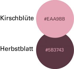
Typography and Color also played an important role in my design process. For the colors I decided to focus on a monochromatic color palette. My intention was to choose colors that appear soft and feminine to represent the topic of motherhood.
I wanted the typography to be not only modern but also grounded and with an rustic touch. The modern appearance is represented in the primary font “Univers”. For the headlines I chose the slab serif font Zilla Slab. The serifs make it feel grounded and stable just like a mother.

Product design

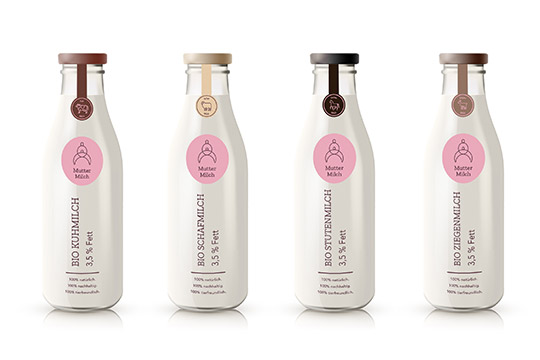
I wanted the product design of the milk bottles to be minimalistic so that the customer could fully concentrate on the logo and the typography of the brand. Muttermilch offers different milk types: cow milk, goat milk, sheep milk and horse milk. For every milk type there was a slightly different design respecting the colors and the picture of the animal so the customer could distinguish them on the first glance.
Social Media Mock Ups
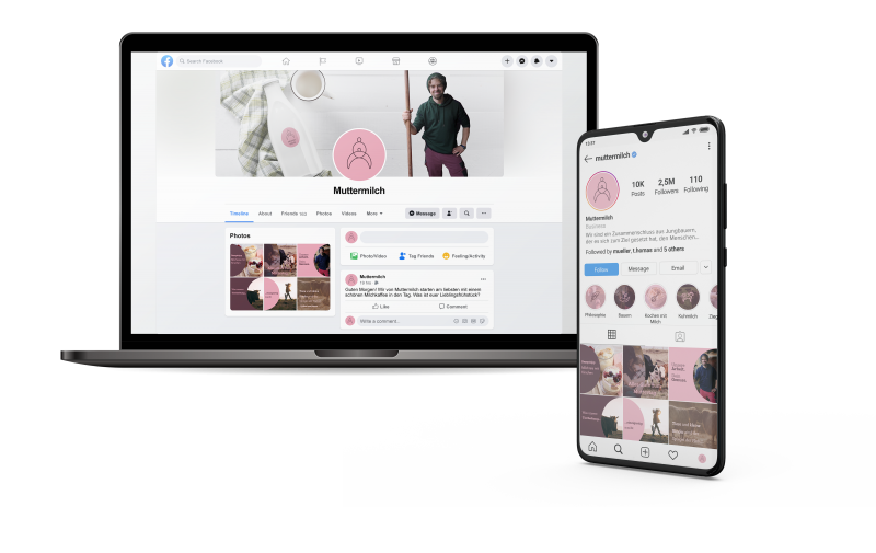
Facebook and Instagram are the preferred channels for my user persona. So I made mock-ups of how the brand would interact with its customers on social media. I used the two main brand colors and played with rounded shapes to make it even more feminine. The posts include emotional content about motherhood but also milk recipes to give an additional value to the followers of Muttermilch.

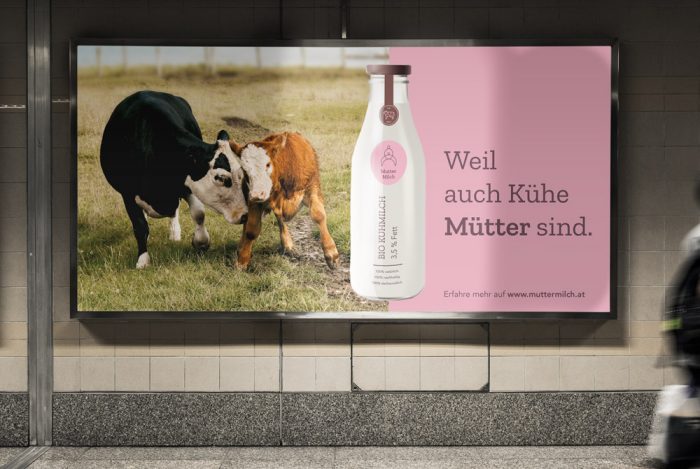
Product Placement in Public

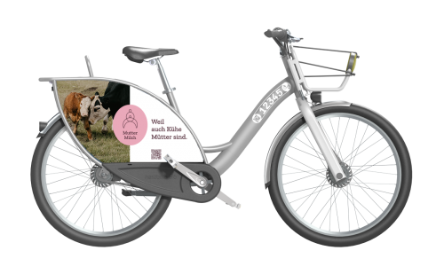
I decided to show how Muttermilch would communicate with potential customers in public. I chose places people with interest in sustainability would visit. Therefore I designed a bilboard on a train station. Also I made a mockup of a rental bike that would have Muttermilch advertising on it.

Summary and Learnings from this project
As it was my first brand design project I learned how to create an convincing brand appearance. I learned that looking on small details is very important when designing for a brand. Also I learned how to improve on feedback I received by other designers. The most challenging was to design a whole Brand personality from scratch. I overcame this challenge by thinking of user personas who represented potential target groups for Muttermilch. Then I was able to create an brand personality that would match the needs of my personas. While the whole project was a huge learning experience, I especially enjoyed designing the brand logo for Muttermilch. It was fun to think of a symbol that combined the love of a mother with care for farm animals.
